

Branding | Rebranding | Logo Design | Packaging Design
PARKGROUNDS CAFÉ
A rebranding design not only for a neighborhood café but also aims to become the neighborhood's essence and symbol.


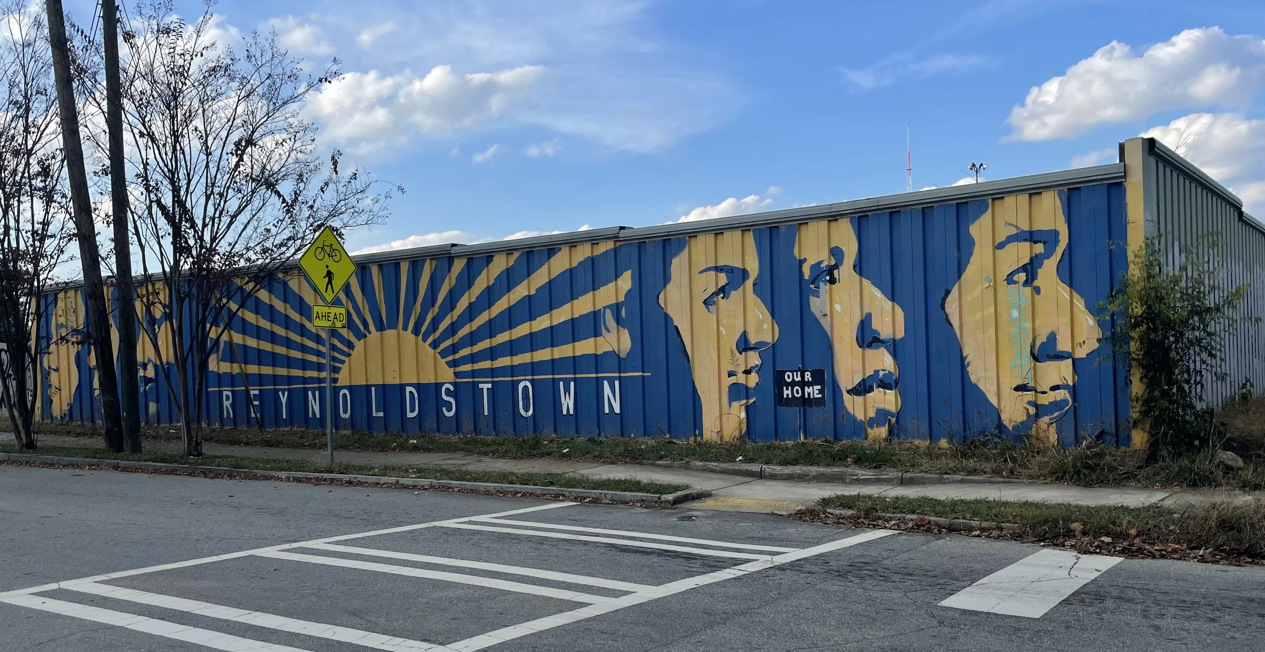
About Reynoldstown
One of the first African-American neighborhoods to develop in Atlanta that Originally began as an area to which former slaves migrated after the Civil War; began to form in the 1860s
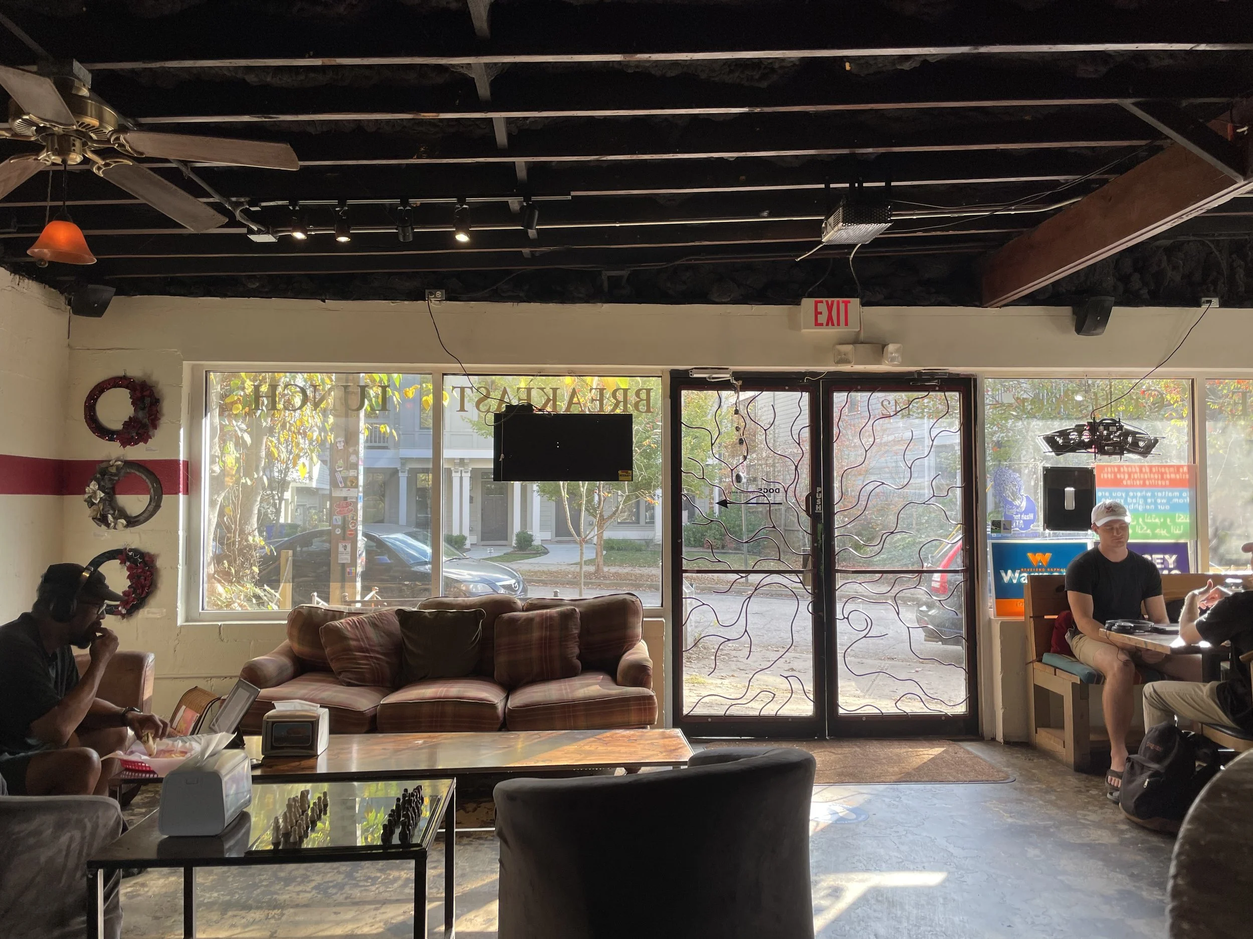
About ParkGrounds Cafe


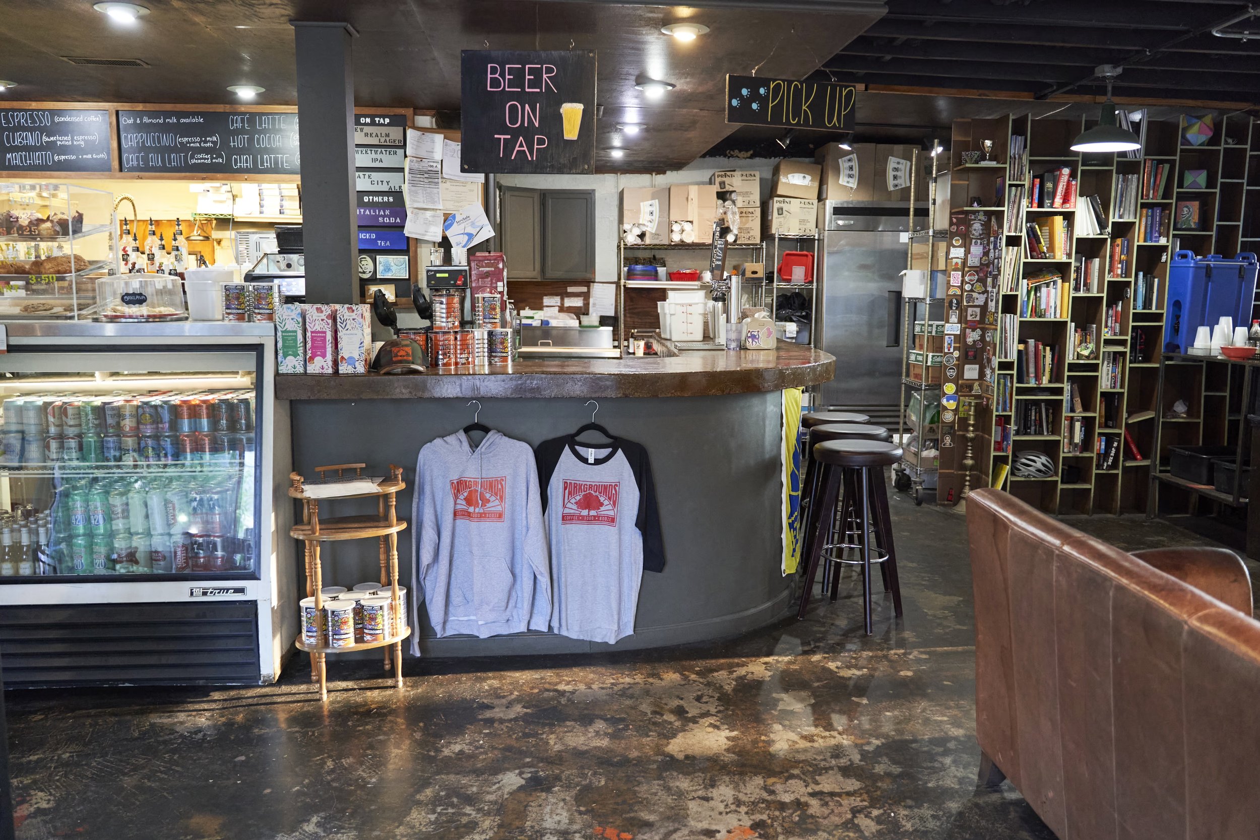
A locally run Cafe hiding in the heart of the Reynoldstown neighborhood. It is not only a Café but a placeholder for neighborhood events and meetings.

Current logo of Parkgrounds Café
Parkgrounds Cafe, as a hidden gem in Reynoldstown, is shamefully lacking a recognizable and cohesive design.
Problem
A recognizable and memorable brand system of Parkgrounds Café that encourages Reynoldstown residents to connect, chat, and celebrate the neighborhood, while also attracting new visitors interested in the area.
Goal
Creating a Warm, Celebrative, Energetic brand voice.
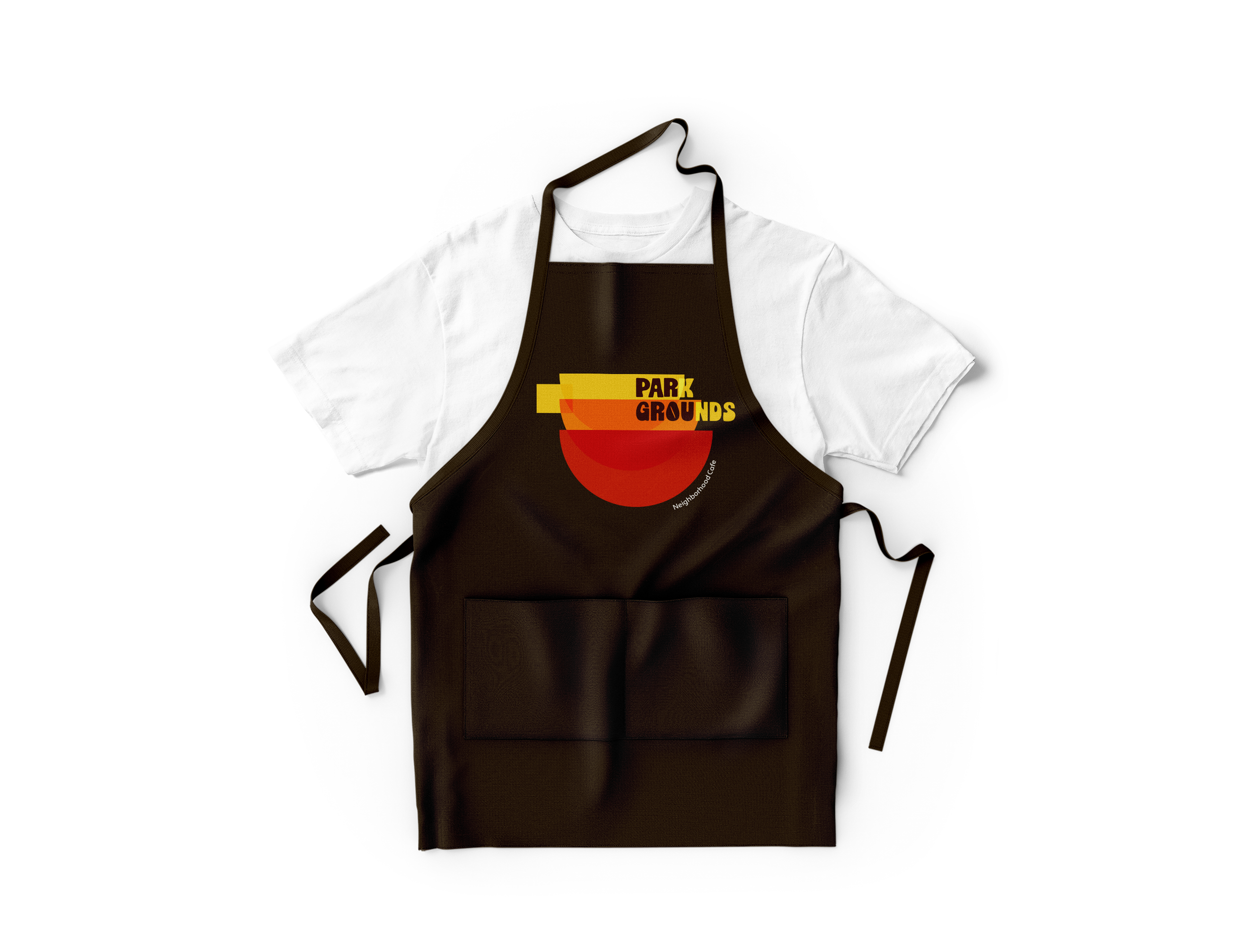
The rebranding includes a new logo, menu design, coffee cup/mug design, takeout packaging, and stuff apron.
Solution


It integrates the concept of sunrise and rainbow (related to the neighborhood and current logo), along with the initial letter 'P', a coffee mug, and two-sized bowls representing their provided menu: breakfast and lunch.
Logo Concept


The color palette is developed from both the neighborhood logo and the current cafe logo, with an emphasis on 'warmness', incorporating different shades of warm tones to imply the sunrise.
Brand Color
The typographic choice lands on an organic and old-fashioned font, emphasizing the “homemade” and nostalgia of the brand.
Brand Typography
Main Brand Font: Cooper Std (Black)

Secondary Brand Font: Cubano (Regular)

Body Font: Apertura (Regular)


Similar Works
-
![]()
SUSTAINABLE SEAFOOD WEEK
Branding | Editorial | Web | Social Media
-
![]()
Talenti
Packaging | Illustration
-
![]()
TRUE
Branding | Packaging Design | Illustration


